


Your desktop website can look perfect and still lose visibility if the mobile version is weak. That is the part many site owners miss. Google does not simply admire your desktop layout and ignore the phone experience. For most websites, the mobile page is the version Google mainly uses to understand, index, and rank the content.
That means one hidden mobile section, one blocked script, one missing product description, or one slow mobile template can create a real SEO problem. Mobile first indexing is not just a design topic. It is a crawling, indexing, content, speed, and user experience issue.
What Mobile First Indexing Means
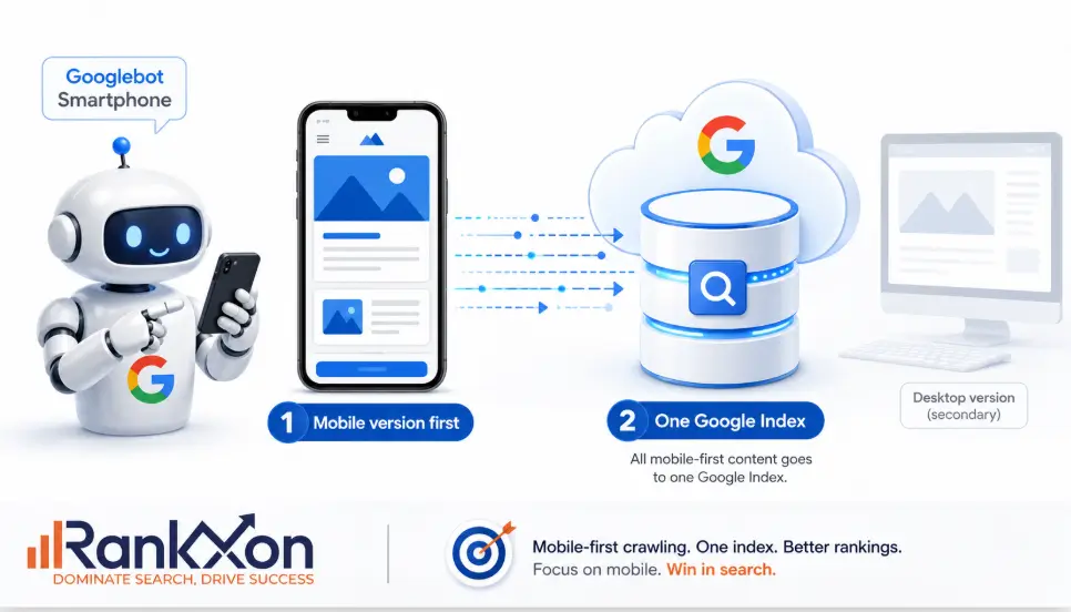
Mobile first indexing means Google mainly uses the mobile version of your page for indexing and ranking. Google still has one index. It does not keep a separate mobile index and desktop index for normal search results. The important point is this: the mobile version becomes the main source Google uses to understand your page.
In simple words, if your desktop page has full content but your mobile page has missing text, missing headings, weak internal links, missing schema, or broken images, Google may understand less about the page than you think.
Google explains that it uses the mobile version of a site’s content, crawled with the smartphone agent, for indexing and ranking. That makes your mobile page the real SEO version of the page in most cases.
Why Google Uses Your Mobile Page First
Google moved toward mobile first indexing because most users browse and search on phones. A search result that looks useful on desktop but fails on mobile is not helpful for the majority of users. So Google wants to evaluate the version that real users are most likely to see.
This shift started years ago and became the normal state of Google indexing. Google also confirmed that mobile first indexing had fully arrived, which means this is not a future trend. It is already how modern SEO works.
For website owners, the lesson is simple. Stop treating mobile as a smaller afterthought. Your mobile page is not a backup design. It is the version that can decide how clearly Google understands your content.

Does Mobile First Indexing Affect Rankings?
Yes, but not in the lazy way many people explain it. Mobile first indexing itself is about which version Google uses for indexing and ranking. It does not mean every mobile issue is a direct penalty. The real risk is that Google may crawl a weaker version of your page.
If the mobile page has less useful content, fewer links, missing structured data, poor image setup, slow loading, or annoying popups, your SEO performance can suffer. The ranking problem comes from what Google can access, understand, and trust on the mobile version.
| Mobile Issue | Why It Matters For SEO | Fix |
| Important text missing on mobile | Google may not see enough content to understand the page fully. | Keep primary content equivalent across mobile and desktop. |
| Different headings on mobile | Topic signals may become weaker or confusing. | Use clear, meaningful headings on both versions. |
| Schema only on desktop | Rich result and entity signals may be incomplete. | Add the same structured data on mobile. |
| Internal links hidden on mobile | Google may discover fewer related pages and understand site structure poorly. | Keep useful navigation and contextual links visible or crawlable. |
| Slow mobile layout | Poor page experience can hurt users and conversions. | Improve Core Web Vitals and mobile speed. |
| Intrusive popups | Users cannot reach the content easily. | Use clean, non intrusive mobile CTAs. |
Mobile First Indexing Versus Mobile Friendly Design
These two terms are related, but they are not the same thing.
| Term | Meaning | Simple Example |
| Mobile first indexing | Google mainly uses your mobile page for indexing and ranking. | Googlebot Smartphone reads your mobile content to understand the page. |
| Mobile friendly design | Your page works properly on a phone. | Text is readable, buttons are easy to tap, and layout fits the screen. |
| Mobile optimized SEO | Your mobile page is useful, fast, complete, crawlable, and conversion focused. | The mobile page has the same main content, links, schema, images, and clear UX. |
A page can be mobile friendly and still weak for mobile indexing. For example, the design may fit the screen, but the mobile version may hide FAQs, remove internal links, or load main content only after a user taps a button. That is where many SEO problems start.
If you want a deeper guide on whether mobile usability is part of modern SEO performance, read RankXon’s guide on mobile friendliness.
What Website Owners Must Keep The Same On Mobile And Desktop
The safest rule is content parity. Your mobile page does not need to look identical to desktop, but it should give Google and users access to the same important information. You can use accordions, tabs, and shorter layouts, but the main content should still be present and accessible.
| Element | Should It Match? | Why |
| Main content | Yes | Google uses mobile content to understand page relevance. |
| Title tag | Equivalent | The page topic and search snippet should stay consistent. |
| Meta description | Equivalent | Snippet messaging should not conflict between versions. |
| H1 and headings | Equivalent | Headings guide topic understanding and reader flow. |
| Structured data | Yes | Schema helps search engines understand entities, products, breadcrumbs, videos, and page type. |
| Images and alt text | Yes | Visual content can support rankings, image search, and accessibility. |
| Internal links | Yes | Links help discovery, topic connection, and crawl flow. |
| Robots meta tags | Yes | A wrong noindex or nofollow on mobile can damage indexing. |
For broader ranking context, connect this article naturally to RankXon’s guide on SEO ranking factors, because mobile performance works with many other signals.
Common Mobile Indexing Mistakes That Hurt SEO
1. Removing content from mobile pages
This is the most dangerous mistake. Many designers remove long product descriptions, FAQs, comparison tables, reviews, or service details from mobile to make the page look cleaner. Cleaner is good, but removing the content completely is risky. If Google sees less content on mobile, it has less information to use.
2. Blocking mobile resources
Google needs to render the page. If CSS, JavaScript, images, or other resources are blocked, Google may not see the page the way users see it. That can create crawl and rendering problems.
3. Loading main content only after interaction
Do not make Google depend on swipes, clicks, typing, or custom actions to see the primary content. Google’s guidance is clear that content requiring user interaction may not load for indexing. Accordions can be fine when implemented correctly, but the content should be present in the HTML and accessible.
4. Different metadata on mobile
If your mobile title tag or meta description is different from desktop without a clear reason, your page signals can become inconsistent. Keep them equivalent and focused on the same search intent.
5. Missing structured data on mobile
Schema should not live only on desktop templates. Breadcrumb, Product, Article, FAQ, VideoObject, and LocalBusiness schema can all support search understanding when used correctly. If the mobile template drops schema, the page becomes weaker.
6. Slow mobile templates
Mobile users often browse on weaker connections and smaller screens. Heavy scripts, oversized images, poor hosting, render blocking files, and layout shifts can damage the experience. Speed is not the whole SEO story, but it affects users, conversions, and page experience.
For the speed side of this topic, link to RankXon’s guide on page speed where it fits naturally in the article.
How To Check If Your Website Is Ready
Do not guess. Check the page like Google would check it. The homepage is not enough. Test your service pages, blog posts, product pages, category pages, and high traffic landing pages.
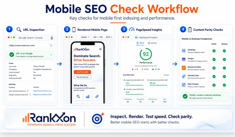
- Open Google Search Console and inspect an important URL.
- Use URL Inspection to view crawl status and indexing signals.
- Check the rendered page and compare it with the live mobile page.
- Run PageSpeed Insights for mobile performance and Core Web Vitals clues.
- Compare mobile and desktop content manually. Check headings, body text, FAQs, images, internal links, and schema.
- Review robots meta tags, canonical tags, redirects, and blocked resources.
- Check mobile navigation. Make sure important pages are reachable from the mobile menu and internal links.
Mobile First Indexing Checklist
| Check | Pass Condition | Priority |
| Mobile page contains the main content | Same primary content as desktop. | High |
| Mobile headings are clear | Same main topic and logical H2 structure. | High |
| Structured data is present | Same schema types on mobile and desktop. | High |
| Title and meta description match intent | Equivalent metadata across versions. | Medium |
| Images are crawlable | Useful images, stable URLs, alt text, supported formats. | Medium |
| Resources are not blocked | Google can access CSS, JS, images, and key files. | High |
| No wrong robots meta tag | No accidental noindex or nofollow on mobile. | Critical |
| Internal links remain available | Important related pages are linked on mobile. | High |
| Mobile speed is acceptable | No heavy scripts, large images, or major layout shift. | Medium |
| Popups do not block content | Users can read the content without friction. | Medium |
If these checks reveal crawl, speed, schema, or rendering problems, the issue belongs under technical SEO, not just web design.
When You Need A Technical SEO Audit
You should not wait for a traffic drop to check mobile indexing. A technical audit is needed when rankings fall after a redesign, mobile pages look thinner than desktop, product pages are not indexing, Search Console shows crawl or indexing issues, or Core Web Vitals look poor on mobile.
A good audit should compare mobile and desktop versions page by page. It should check rendering, metadata, schema, internal links, content parity, speed, crawlability, canonical tags, robots tags, and template level problems.
RankXon can support this through a full SEO audit or strategic SEO consulting if the issue is tied to a redesign, traffic loss, or weak mobile performance.
Mobile First Indexing Best Practices
- Use responsive design when possible because it keeps the same URL and the same HTML easier to manage.
- Keep primary content equivalent across desktop and mobile.
- Use the same important structured data on both versions.
- Keep titles, descriptions, headings, and canonical tags consistent.
- Make sure Google can crawl CSS, JavaScript, images, and key resources.
- Avoid hiding important information only to make the mobile page look shorter.
- Compress images and improve Core Web Vitals without removing useful content.
- Make mobile navigation simple, but do not remove important internal links.
FAQs About Mobile First Indexing
What is mobile first indexing?
Mobile first indexing means Google mainly uses the mobile version of your page for indexing and ranking. It does not mean Google has a separate mobile index. It means your mobile page is the main version Google uses to understand the content.
Why is mobile first indexing important?
It is important because the mobile version can decide how clearly Google understands your page. If the mobile version is missing content, links, schema, or important resources, your search performance may become weaker.
Does Google look at my mobile site first?
For most websites, yes. Google primarily crawls and evaluates pages with a smartphone agent. Your desktop version still matters for users, but the mobile version is usually the main version for indexing and ranking.
Is mobile first indexing the same as mobile friendly design?
No. Mobile friendly design means your website works on a phone. Mobile first indexing means Google mainly uses the mobile version for indexing and ranking. A site can be mobile friendly but still have mobile SEO problems.
Can hidden mobile content hurt SEO?
It can, especially if important content is removed or loaded only after user interaction. Content in well built accordions can be fine, but the main content should still be accessible to Google.
Do I need a separate mobile website?
Usually no. Google recommends responsive design because it is easier to maintain. Separate mobile URLs can work, but they create more risk with redirects, canonicals, duplicate signals, and content mismatch.
How do I check mobile indexing issues?
Use Google Search Console URL Inspection, compare mobile and desktop content, check rendered HTML, run PageSpeed Insights, review structured data, and make sure important links and resources are crawlable.
What does first indexed mean?
First indexed generally means the page was first discovered and added to a search engine index. In mobile first indexing, the key idea is that Google mainly uses the mobile version when indexing and ranking the page.
Conclusion
Mobile first indexing means Google mainly judges your website through the mobile version. If that version is complete, fast, crawlable, and easy to use, you are in a safer position. If it is missing content, schema, internal links, or important resources, your rankings can suffer even when the desktop site looks strong.
The real rule is simple: build your mobile page as the main SEO page, not as a trimmed copy of the desktop version.
